High Fidelity Design (Music App)
The next step I took in designing my music app after the first round of user testing was to begin branding and high fidelity design. To begin designing I practiced flash branding in order to quickly develop something recognizable for my brand. I created a series of adjectives to describe my brand such as: tactile, accessible, and contemporary. I aimed to realize all of these through my design. I then developed a logo and design system, which would reflect and illustrate my brand ideas and principles.

Brand Logotype

Brand App Icon
Brand Design System
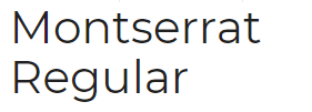
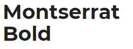
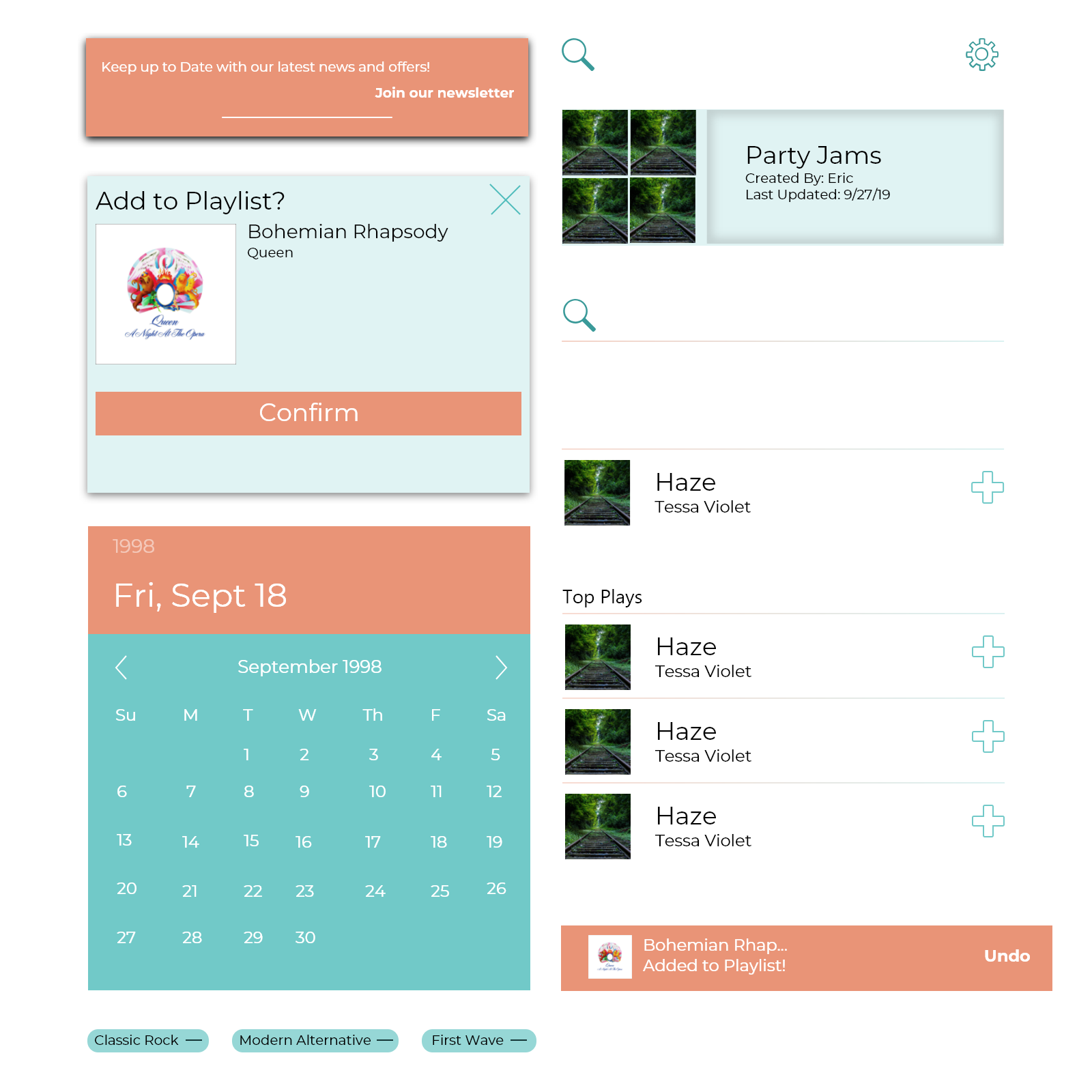
My system developed to reflect both my brand and my audience. I chose the font Montserrat because I wanted it to reflect a light and friendly atmosphere that I believe my target demographic, older professionals, enjoys. I chose a color scheme based off the warm orange, peach color and the teal blue to complement it. The warm black acts as a neutral to help ground the other two colors. Each of these choices were used, through tints and shades, for various states of the components. The orange was used as my main active state for components such as buttons, active pages, and active tabs.
Fonts:
Components:
Final Screens
After these design and brand choices were made, I then began adding them to my low fidelity design to create my app design. Below is a sampling of some finalized screens
from my app.
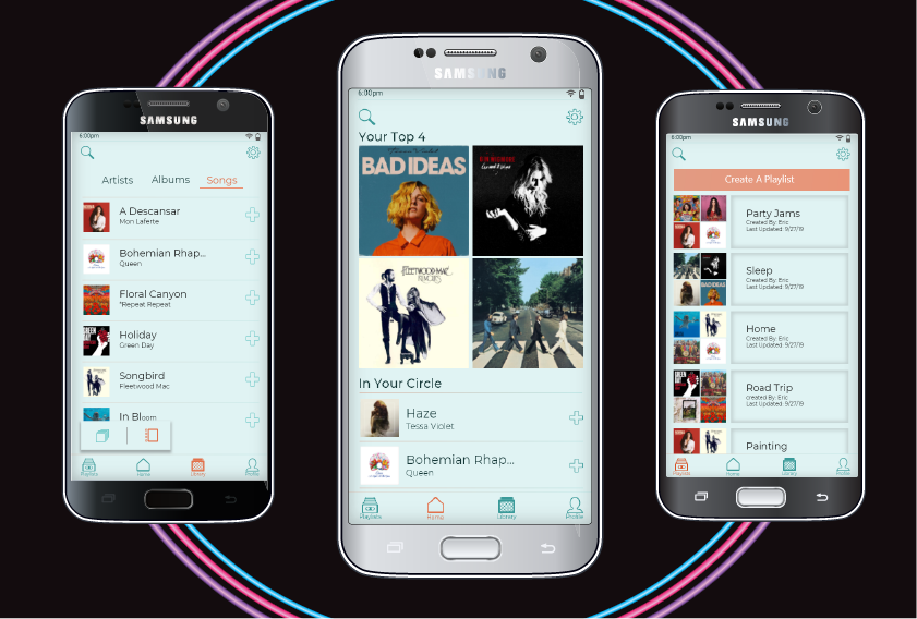
Sample Screen Mock-ups