Type Profile
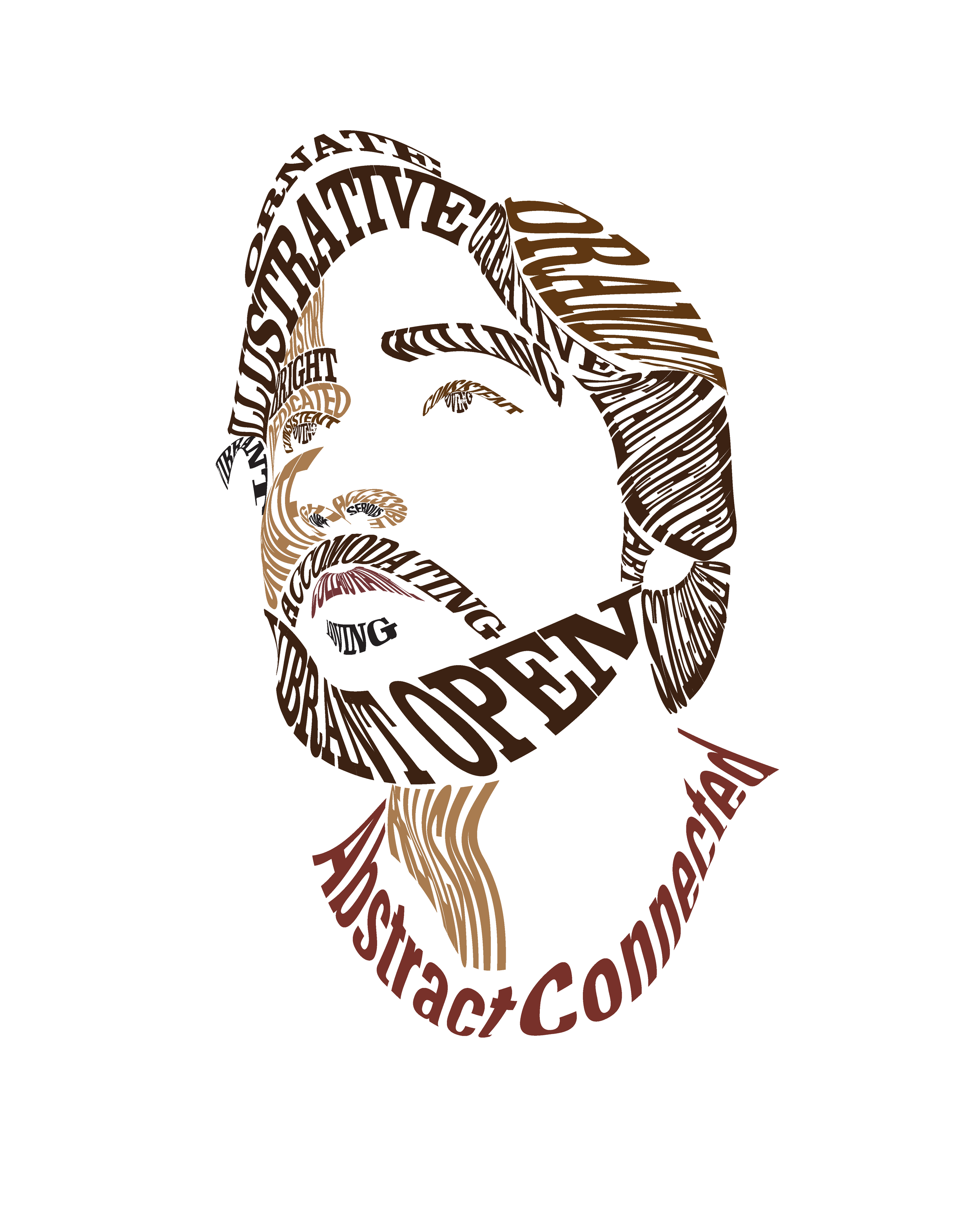
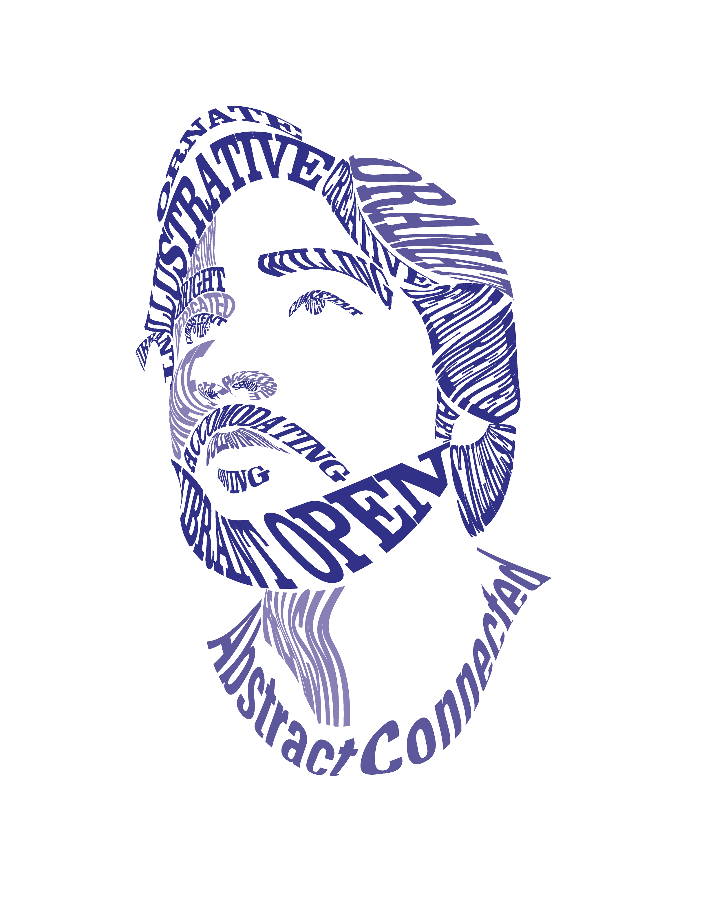
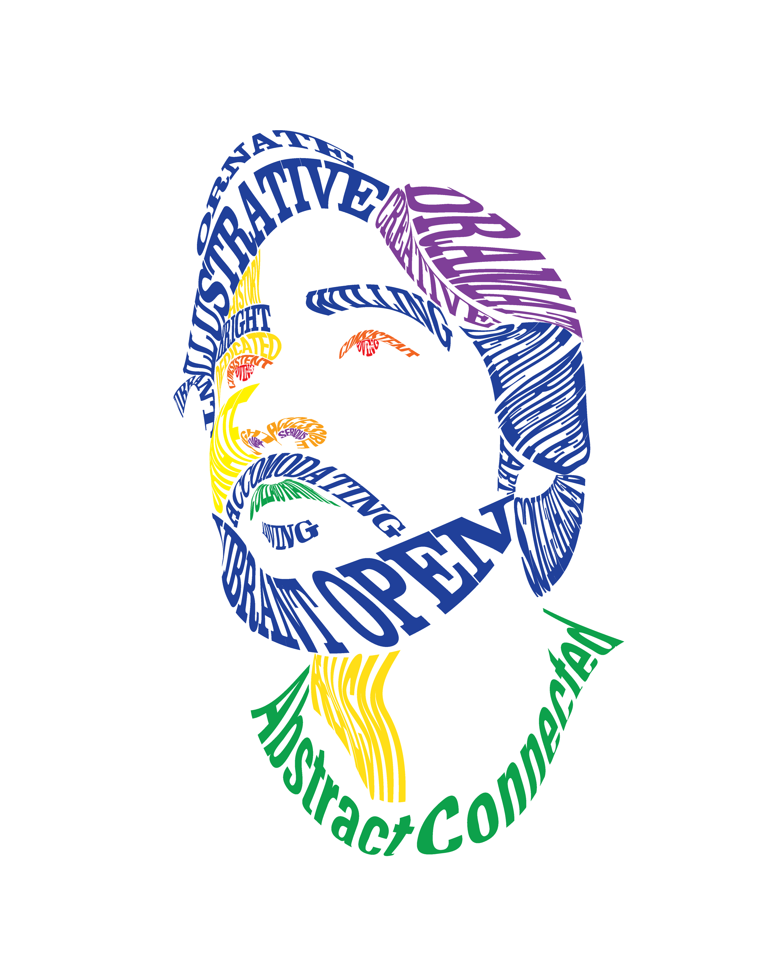
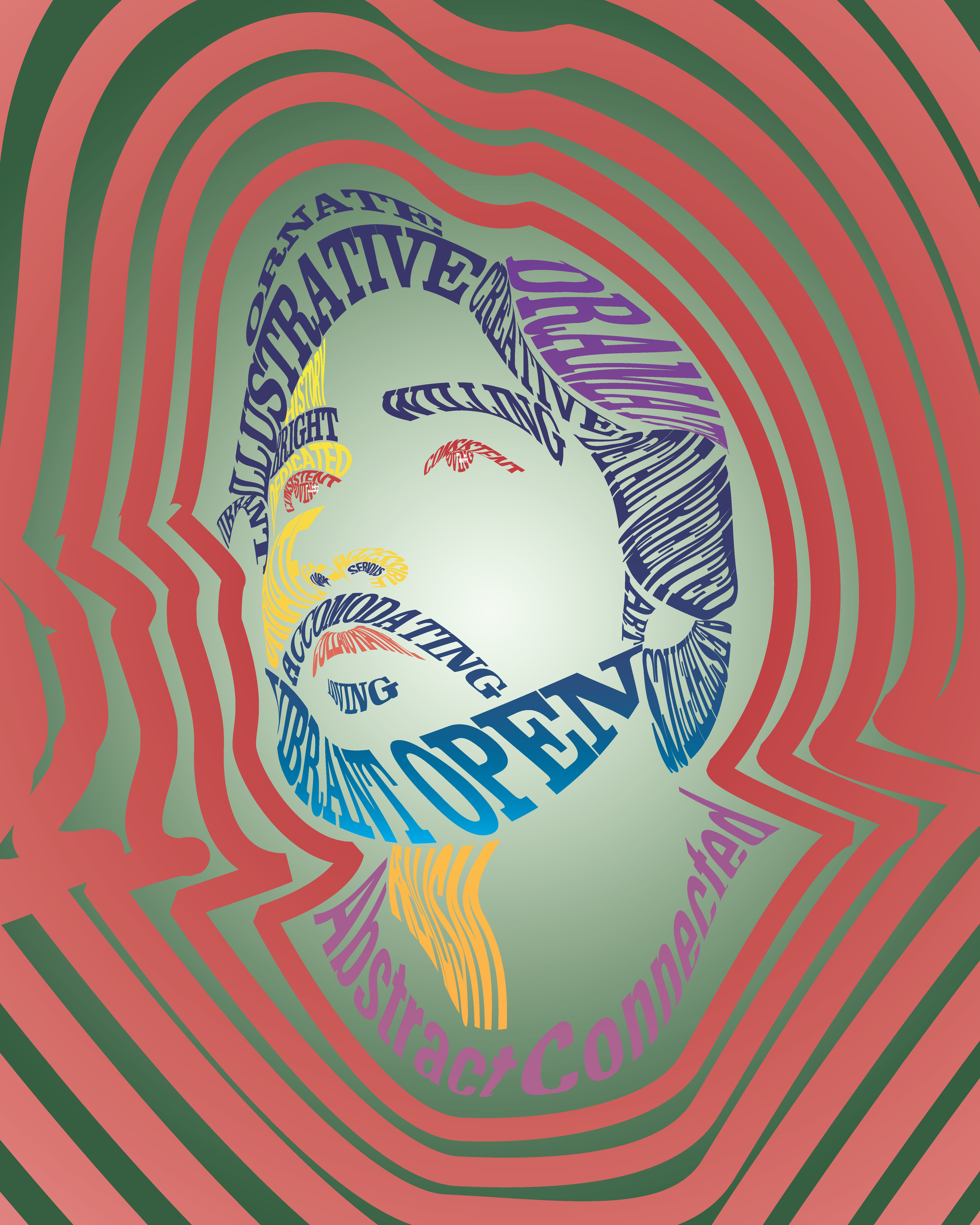
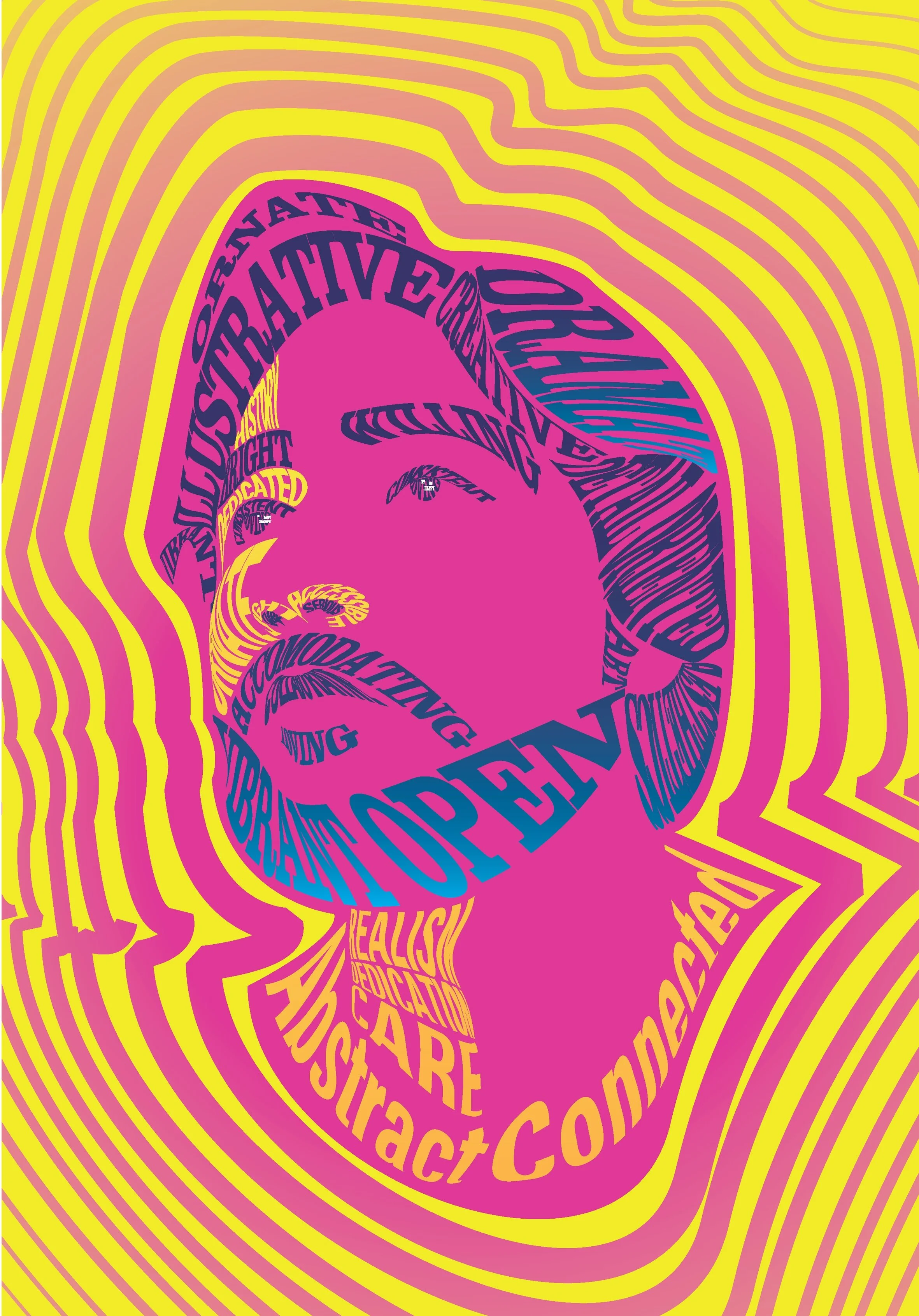
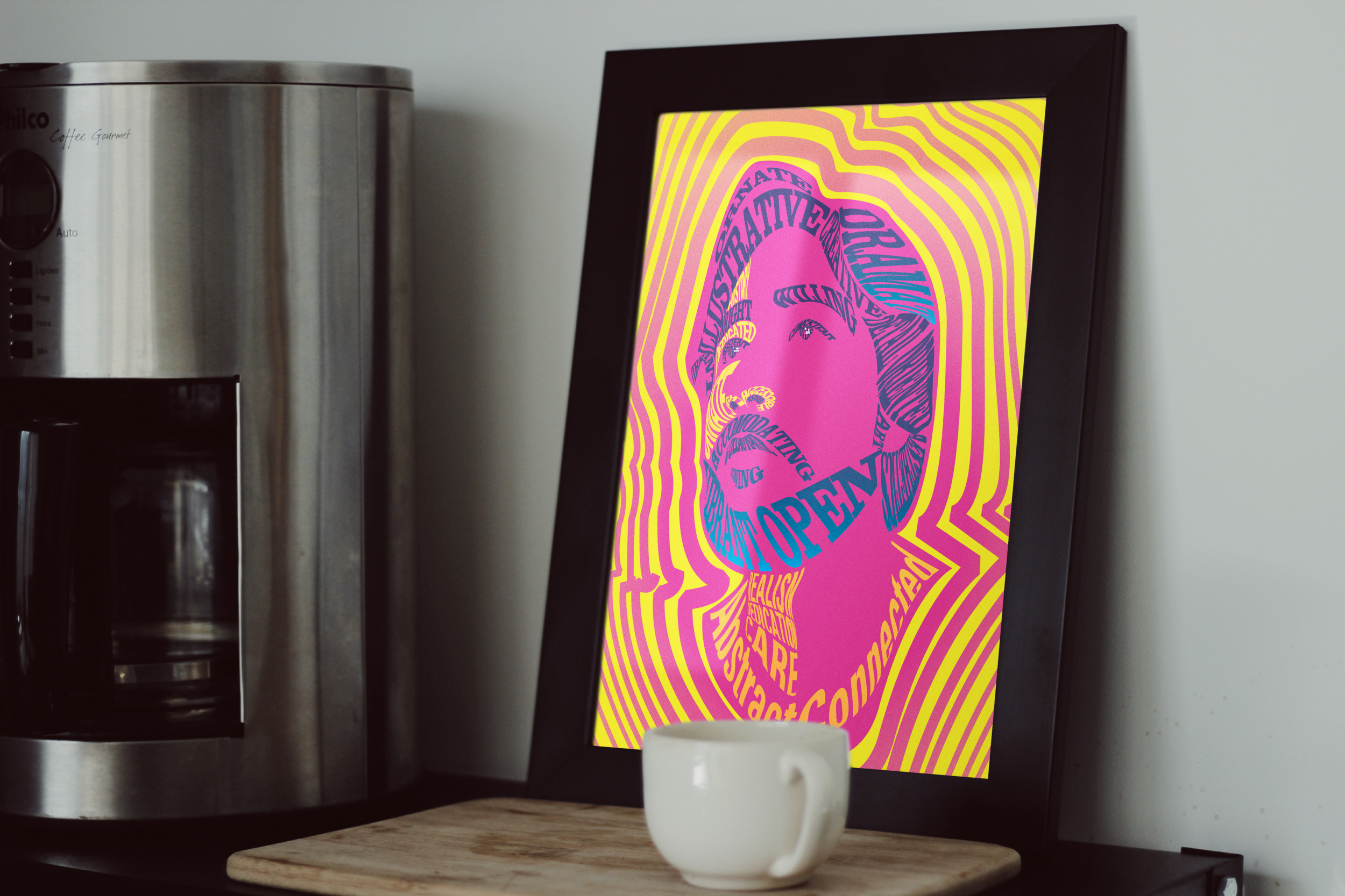
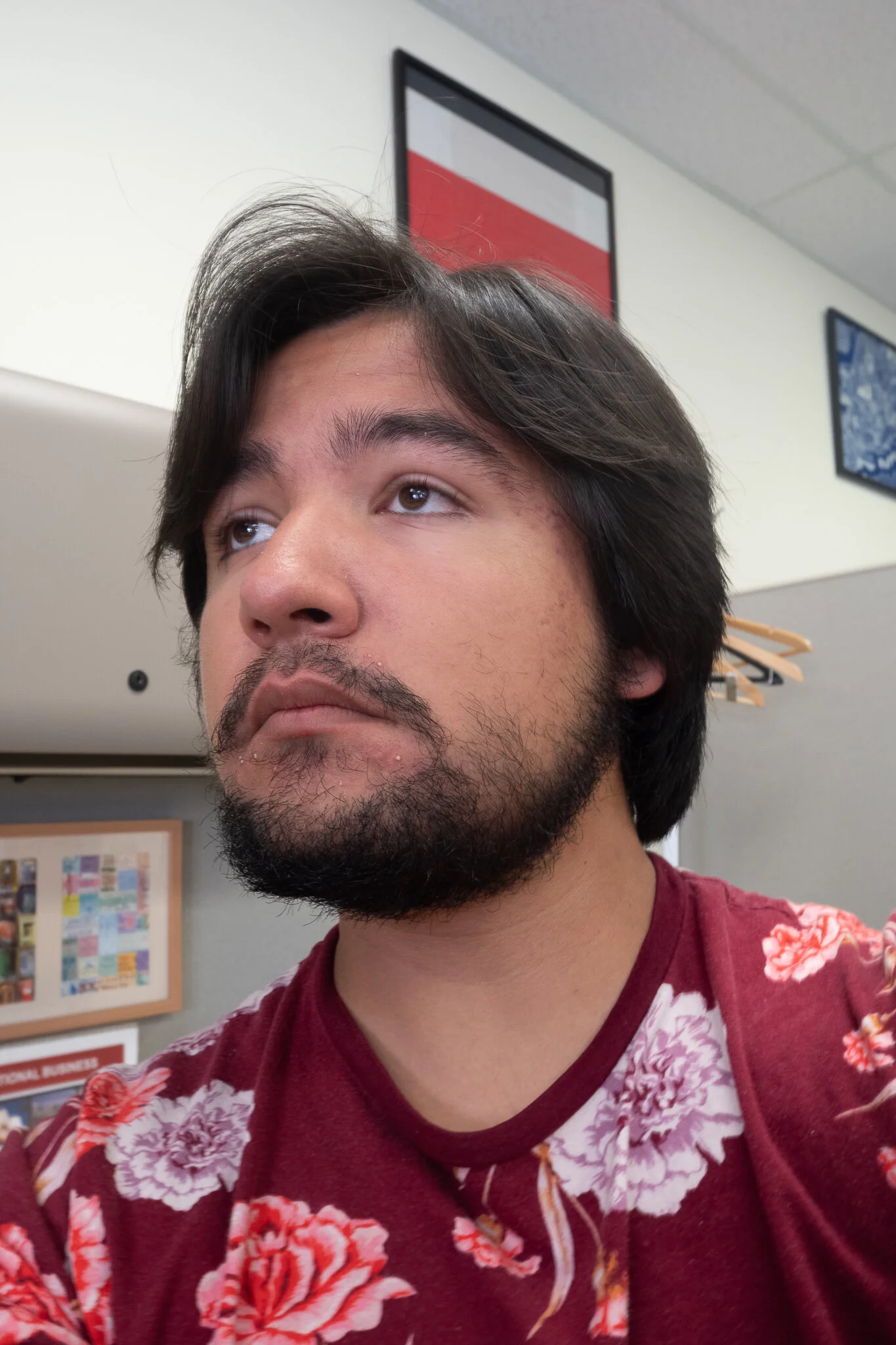
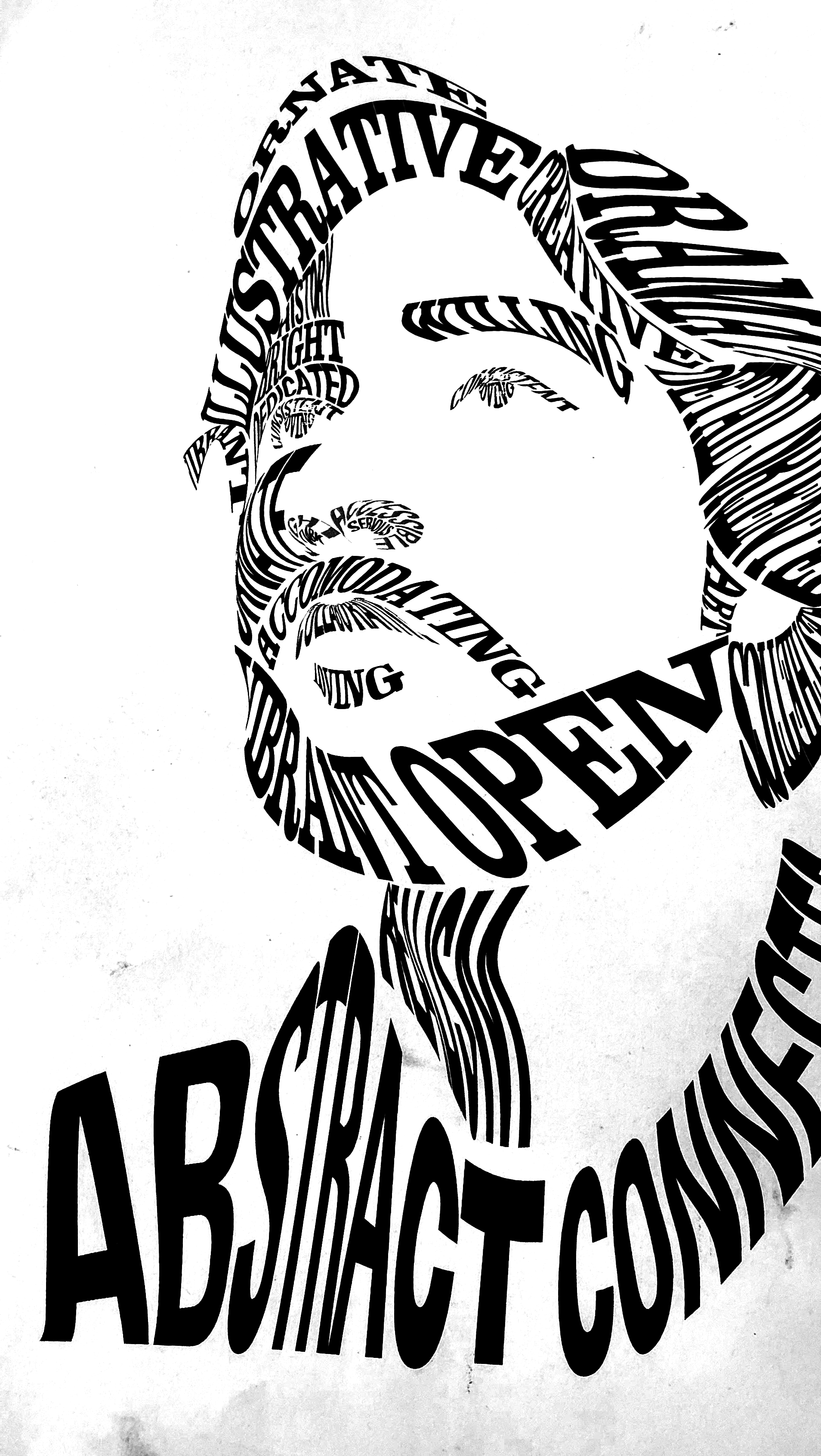
The intent of this project was to create a self portrait using typography as the medium, the text of which would be gained from the designers descriptions of themself. In my exploration, I chose to focus on using the weight of the fonts used in order to create value. Firstly a photo was taken which would provide a good guide for an examination of value. The photo was then traced and text was applied by hand in different manners in order to try different layouts. Next the work was taken into illustrator in order to try different manners of applying the text. I chose a system of warping text in order to achieve the forms of the face. Next color studies were done to look at the way that color could present hierarchy. Many options were tried, but I chose to pursue a psychedelic theme in my coloring to benefit the look of the piece. The final product is shown below.
Original Photo & Initial Sketches
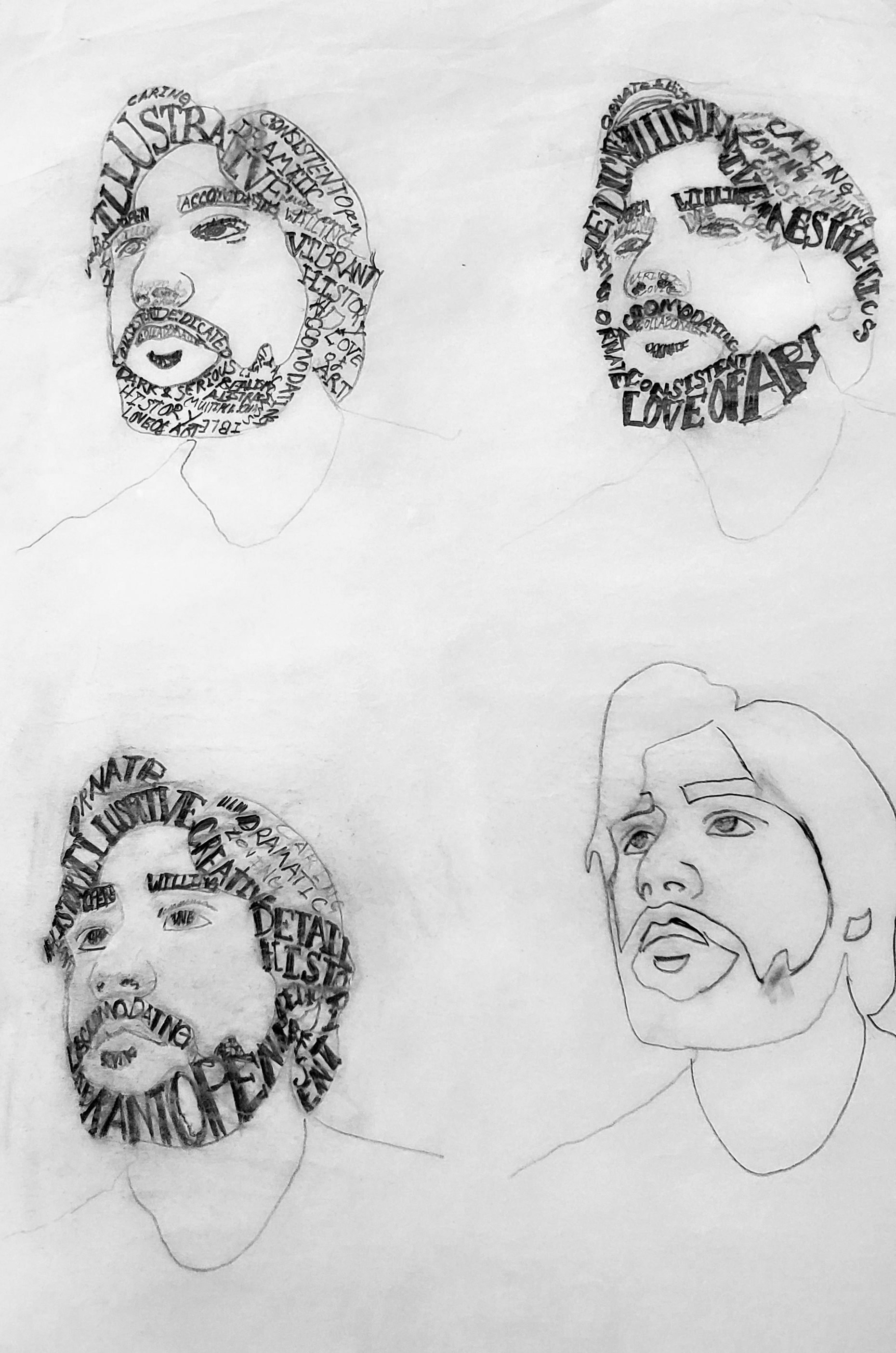
Original Black and White Exploration
The font Systems chosen here were Clarendon bold, and Univers condensed bold.
Color Studies